Most advice about funny email pictures is too loose to trust. It treats any joke image as a harmless engagement trick, when the outcome depends on who receives it, why you sent it, whether you have the right to use it, and whether the visual still makes sense when the email client strips or blocks parts of the design.
That matters more in B2B than people admit. A funny image that works in an internal team update can look careless in a first-touch outbound email. A meme that gets a laugh on LinkedIn can look dated or confusing in a buying committee's inbox. Even a good joke can fail if the file is heavy, the text is baked into a tiny image, or the licence position is vague.
The performance side isn't simple either. Graphics in email have been associated with stronger engagement in several email marketing datasets, but the gains come with practical caveats around rendering, mobile viewing, and conversion structure. In one analysis of more than 5,000 campaigns, emails with images delivered a 42% higher click-through rate than campaigns without images, with the strongest results clustering around 1, 3, and 5 images, while 80% of campaigns used five images or fewer, according to Snov.io email marketing statistics. That doesn't mean every joke image helps. It means image choice and placement need discipline.
For B2B teams, the safest approach is simple. Use funny email pictures that are relevant, readable, licensed clearly, and easy to defend to a colleague, customer, or legal reviewer.
1. Adobe Stock
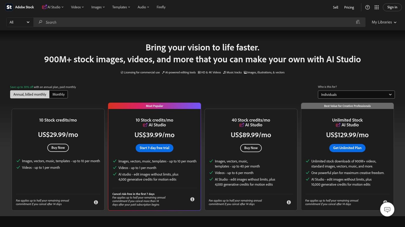
If rights certainty is the priority, Adobe Stock is one of the easiest places to start. It gives you a large library of photos, illustrations, and vectors that can land as funny without looking like a recycled internet meme. For B2B campaigns, that distinction matters. You often want a visual that is lightly comic, not aggressively online.
The practical advantage is control. Adobe Stock's licensing is built for commercial teams, and its search filters are good enough to narrow humour by style, subject, and format instead of dumping you into low-quality joke content. That makes it useful when you need an image for a campaign that still has to look brand-safe in front of procurement, operations, or senior buyers.
Where Adobe Stock works best
Adobe Stock is strongest when you need professional polish with minimal debate over whether the asset belongs in a client-facing email.
- Best fit: Humorous illustrations for newsletters, event invites, product update emails, and nurture campaigns.
- Less ideal: Fast-moving meme jokes tied to a niche online reference.
- Format advantage: Vectors and clean illustrations usually compress better than busy lifestyle photography.
Practical rule: If the joke needs prior internet context to work, Adobe Stock probably isn't the best source. If the image can support the message on its own, it probably is.
One caution: paid libraries can tempt teams to overproduce. Just because the image looks good doesn't mean it earns its place. Keep the humour secondary to the email's purpose.
Adobe Stock also suits teams that need admin controls, shared access, and a cleaner release trail. If your company has a brand reviewer or outside clients, that boring operational detail is often more valuable than the joke itself. You can review Adobe's current licensing and plans on Adobe Stock pricing and plans.
2. iStock by Getty Images
Funny email pictures rarely fail because they are unfunny. They fail because the image looks expensive, loads heavily, or pushes the sender a step too close to clownish. iStock is useful because it gives you more control over that balance than many broad stock libraries.
Its sweet spot is restrained humour. The catalogue is strong for polished illustrations, mild visual exaggeration, and office scenarios that read as knowing rather than desperate. If the email is going to a buyer, operations lead, or finance stakeholder, that distinction matters. A joke that feels safe in a social post can feel cheap in a sales follow-up.
I use iStock when the brief is simple: add personality, keep procurement calm, and avoid any debate about whether the creative team has gone off-script.
Here is the practical read on it:
- Comic potential: Better for dry workplace humour than internet-native jokes or trend references.
- Licensing clarity: Commercial use is generally straightforward, which helps when approval sits with legal or brand teams.
- Brand suitability: Strong fit for companies with a conservative visual system that still want some warmth.
- File practicality: Vectors are the smart buy here. They stay sharp, resize cleanly, and are easier to export at email-friendly weights.
- Main risk: Some of the funnier photo results still have that staged stock look, which can flatten the joke fast.
Cost needs watching. iStock can be efficient if you buy occasional credits for one-off campaigns, but the more distinctive Getty-adjacent assets can push the price up quickly. That is a real trade-off if you are testing humour in email and do not yet know whether the concept earns clicks or just adds decoration.
One more caution. iStock works better for humour that supports the copy than for humour that has to carry the whole message. In B2B email, a light visual nod to meeting overload or spreadsheet fatigue usually travels further than a big comedic setup. Browse the current options on iStock plans and pricing.
3. Shutterstock
Shutterstock is the option I pick when the brief is still fuzzy. If the team is debating whether the joke should be deadpan, illustrated, slightly absurd, or just a mild visual wink, its library gives you room to test several directions without changing platforms.
That range cuts both ways. You can find useful assets fast, but you can also lose an hour sorting through overacted office photos, dated meme-style graphics, and illustrations that read more startup blog than email creative. The comic upside is breadth. The practical cost is curation.
For B2B email, the advantage is licensing clarity. Shutterstock's standard image licence explicitly includes email marketing, which lowers friction with legal and brand reviewers. That matters more than having endless choices, especially if the image is funny enough to attract scrutiny.
A quick way to judge whether Shutterstock is the right fit:
- Strong fit: Teams testing multiple creative routes for the same campaign, especially across newsletters, nurture emails, and sales support sends.
- Weak fit: Anyone who needs a great result from the first page of search results.
- Safest asset type: Clean vectors and simple illustrations. They compress well, stay readable on mobile, and usually age better than staged humour photography.
- Main risk: Humour can fall flat if the image looks like stock first and joke second.
I also treat Shutterstock as a source for support visuals, not as the whole punchline. Email clients still handle images inconsistently, and some recipients will miss the joke if the copy does none of the work. In practice, the safer pattern is a clear subject line, solid body copy, and an image that sharpens the tone rather than carrying it alone.
One more trade-off. Shutterstock is efficient for teams that need volume and variation, but quality depends on who is searching, what keywords they use, and whether anyone is willing to reject the obvious picks. If your brand voice is tightly controlled, that review step is not optional. You can check the current options on Shutterstock pricing.
4. Envato Elements
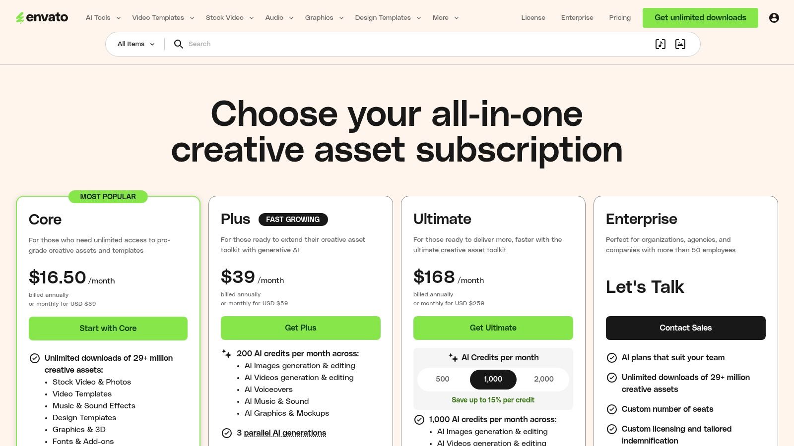
Unlimited downloads sound efficient until someone starts pulling random “funny” assets that look cheap, clash with the brand, or need extra review. That is the Envato trade-off. You get range and speed, but quality control shifts to your team.
Envato Elements is useful for email work when the joke is light and the asset plays a supporting role. I would look here for illustration packs, icons, editable graphics, and simple character scenes that can reinforce a message without turning the whole send into a comedy act. That approach travels better in B2B than a loud visual gag, and it usually keeps file sizes easier to manage.
Licensing is workable, but it is not hands-off. Envato's model requires you to register each asset to a project, so the legal side is only clean if your team is organised. For one-off campaigns, that admin step is minor. For agencies, distributed teams, or anyone repurposing visuals across multiple sends, it needs process.
A practical way to judge Envato is to ask four questions before downloading anything:
- Is the humour usable or just decorative? A cute illustration can soften tone, but it rarely carries a whole email by itself.
- Is the licence trail clear for this campaign? If nobody can show where the asset was registered, approval gets harder.
- Will the file behave well in email? Vectors and simple exports are usually safer than detailed photo composites or heavy layered graphics.
- Would this still look credible in front of a cautious buyer? If the answer is no, save it for internal emails or lower-stakes nurture sends.
That last point matters more with Envato than with tighter-curated libraries. The catalogue includes strong material, but it also includes plenty of visuals that feel generic, dated, or too playful for serious commercial email. Brand suitability is not built in. Someone on the team has to enforce it.
Used carefully, Envato earns its place as a production library, not as a shortcut to great humour. It suits webinar reminders, event emails, onboarding sequences, and house-style newsletter graphics where consistency and speed matter more than originality. For senior B2B outreach or heavily reviewed campaigns, I would be stricter. The current subscription details are on Envato Elements pricing.
5. Canva Free and Pro
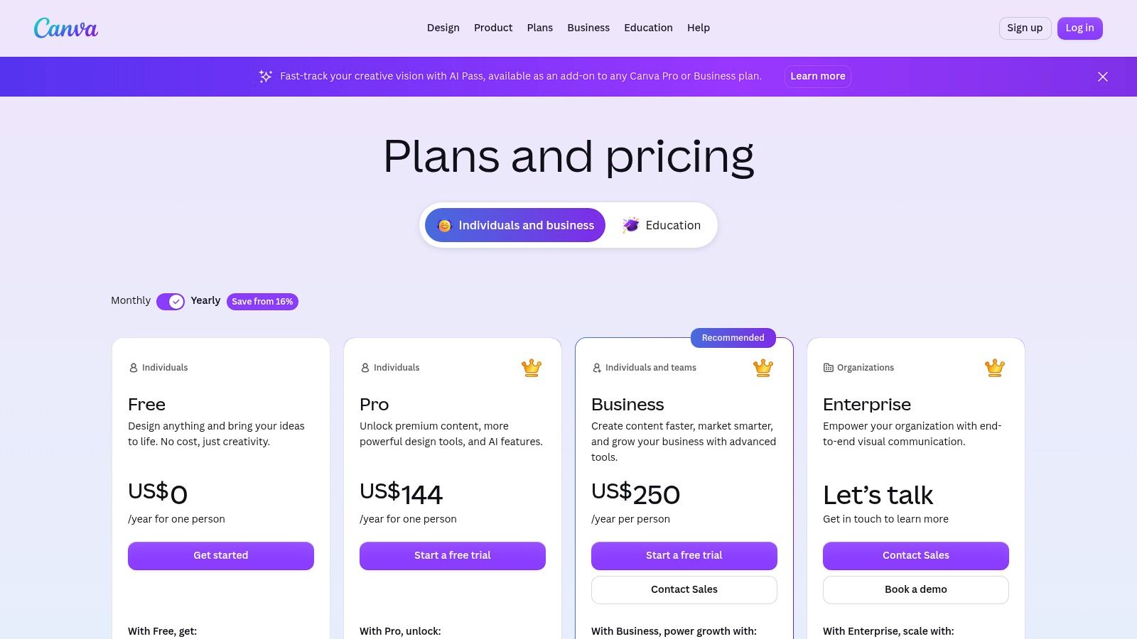
Canva is often the source teams pick when they do not need a funny photo source. They need a fast way to turn a plain idea, a decent caption, and existing brand assets into something usable before the send goes out.
That makes Canva a production tool first, and a humour source second.
The upside is obvious. Brand kits, templates, quick resizing, and a large built-in asset library make it easy to build newsletter headers, event promos, onboarding visuals, and light joke-driven banners without waiting on design support. The downside is just as real. Canva can make mediocre humour look polished enough to pass review, which is dangerous in B2B email because polished weak jokes still fall flat.
I judge Canva on four practical points, but not as a checklist. They tend to rise or fail together.
Licensing is usually acceptable for standard marketing use, especially with Canva Pro, but only if the team knows which elements came from Canva, which were uploaded, and which were pulled from outside creators. Meme-adjacent graphics, screenshots, and repurposed social images are where teams get sloppy.
Brand suitability is the bigger risk. Canva's library includes plenty of cheerful stickers, cartoons, and reaction-style visuals that work for community updates or informal newsletters. Put the same asset in a sales follow-up to a procurement lead, and the tone can turn juvenile fast.
File practicality is one of Canva's stronger points. You can export to predictable sizes, keep layouts simple, and avoid the bulky layered files that create handoff problems elsewhere. Even so, email has little patience for clutter. If the joke relies on tiny text, multiple visual cues, or animation timing, expect weaker results once it hits mobile inboxes.
Comic potential is mixed. Canva helps you customise a joke around your message, which is useful. It is less reliable for finding funny source material that feels fresh.
A good Canva email image usually does one small job well:
- reinforces a subject line
- adds a visual callback in a follow-up
- softens a product or event message
- gives a house-style newsletter a bit of personality
A bad one tries to carry the whole email.
That matters in reply-driven campaigns. If the objective is a response, the visual should support the ask, not compete with it. Teams building those sequences should sort out message structure first, then add humour where it earns attention. H2's guide to cold email follow-up templates is a useful reference for that order of operations.
Canva is a strong choice for in-house marketers who need speed, brand control, and low-friction production. It is a weaker choice when legal review is strict, humour needs to feel original, or the campaign goes to a conservative B2B audience that will punish anything that looks too internet-native. Current plan details are on Canva pricing.
6. Pexels

Pexels is useful for email because it rarely tempts teams into overdoing the joke. The library skews toward real-world photography, so the humour tends to come from expression, situation, or contrast in the copy, not from a forced visual gag. For B2B senders, that restraint is often an advantage.
The trade-off is originality. Pexels has clear, generous licensing for normal marketing use, which makes legal review easier than some user-uploaded image sources. It also means the same “stressed person at laptop” or “awkward office meeting” photo can appear in a lot of campaigns. If your brand already looks generic, Pexels can make that problem worse.
I use Pexels for emails where the image only needs to support the message.
A reminder email about deadlines can get away with a mildly exasperated face. A webinar promo can use a quirky desk photo to lower the temperature. A customer newsletter can add personality with an odd but clean lifestyle shot. If the visual needs to deliver the full punchline on its own, Pexels is usually the wrong source.
What matters here is fit, not just whether the image is funny.
- Licensing clarity: Strong for standard email marketing use, but teams still need to avoid implying endorsement by identifiable people or brands.
- Brand suitability: Safer for conservative B2B audiences than meme-heavy sources.
- File practicality: Good. Photos are easy to crop, compress, and adapt for common email modules.
- Humour risk: Medium. The image may feel pleasant rather than funny, which is often better than trying too hard and missing.
There is also a production benefit. Pexels images tend to hold up better than text-heavy joke graphics once they are resized for mobile inboxes. That said, subtle humour still needs copy support. If the recipient cannot tell why the image is there within a second, it becomes decorative weight.
Pexels is available at Pexels free stock library.
7. Unsplash Free and Unsplash+
Unsplash earns its place in this list for a different reason than the obvious joke libraries. It is useful when the email needs a dry smile, not a punchline. That distinction matters in B2B, where a forced gag can make a sender look lightweight faster than it wins attention.
The free library and Unsplash+ both skew toward polished, editorial-style photography. That gives you better odds of finding an image that feels current and brand-safe, but it also changes the creative job. The photo usually sets the tone. Your subject line and copy still have to carry the joke.
A founder update about internal chaos can work with an overly pristine desk photo that feels slightly absurd. A product email about feature bloat can pair well with an image that looks calm on the surface but subtly overcomplicated. For outbound teams writing restrained, text-led campaigns, that kind of humour tends to age better than meme-style visuals. H2's guide to cold email best practices fits that approach well.
What I like here is the trade-off. Unsplash gives you cleaner aesthetics and fewer cartoonish clichés, but it asks for better editorial judgment. Pick the wrong image and the humour disappears completely. Pick one that is too stylised and the message starts to look like a magazine spread instead of an email.
A quick screening framework helps:
- Comic potential: Better for irony, awkwardness, and visual understatement than obvious jokes.
- Licensing clarity: Good for standard marketing use, but still review likenesses, visible trademarks, and any use that could imply endorsement.
- Brand suitability: Strong for professional newsletters, founder notes, product updates, and higher-trust B2B sends.
- File practicality: Usually manageable, though some images need tighter crops and heavier compression to avoid bloated email modules.
- Humour risk: Medium to high if the copy is weak. The image rarely explains itself.
Unsplash+ can help if you want a more curated feel or need assets that look less recycled than the free pool. Even then, I would not use Unsplash for the hero image if the visual itself has to deliver the laugh with no setup.
You can browse the collection on Unsplash and Unsplash+.
8. Pixabay
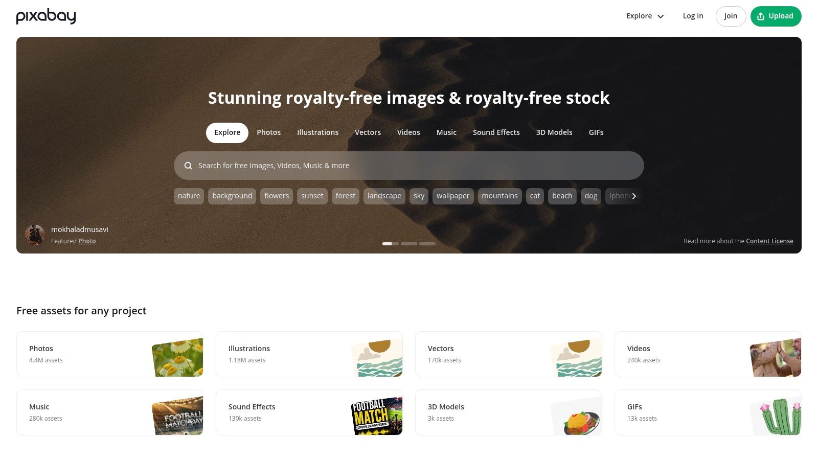
Pixabay is useful for funny email pictures when you stop judging it like a stock photo library and treat it like a source of low-risk visual utility. The best assets here are often vectors, icons, and simple illustrations that can support a joke without dominating the email. That matters in B2B, where the laugh usually needs to stay in the margins.
I use Pixabay more for controlled humour than for punchlines. A small cartoon in a newsletter header, a lightweight illustration beside a product update, or a simple office-themed visual in internal comms can work well. A broad, goofy hero image usually does not. If the humour has to carry the whole send, Pixabay can look generic fast.
Licensing is one reason teams keep coming back. The commercial-use terms are straightforward enough for routine marketing work, and the lack of an attribution requirement keeps production simple. Still, it is a user-uploaded platform. Review each file like a cautious marketer, not a casual browser. Check for trademarks, copied characters, brand lookalikes, and uploads that feel scraped from somewhere else.
The file-format trade-off is good. Vectors and flat illustrations are easier to compress, crop, and fit into responsive modules than expressive photography. They also survive dark mode and small mobile screens better. The downside is aesthetic quality. Weak illustration work makes an email feel cheaper than it is.
A quick verdict:
- Comic potential: Better for light office humour, visual metaphors, and reaction-style cartoons than sharp, memorable jokes.
- Licensing clarity: Fairly clear for standard commercial use, but still review individual uploads for IP problems.
- Brand suitability: Safer for internal emails, nurture campaigns, and softer B2B sends than for high-stakes prospecting.
- File practicality: Strong. Lightweight formats and simple shapes usually behave well in email.
- Humour risk: Medium. Many assets are usable, but plenty look like dated clip art.
That last point decides whether Pixabay helps or hurts. If the illustration looks like something pulled from an old training deck, the joke dies and the brand takes the hit. You can browse the library at Pixabay free images and vectors.
9. GIPHY
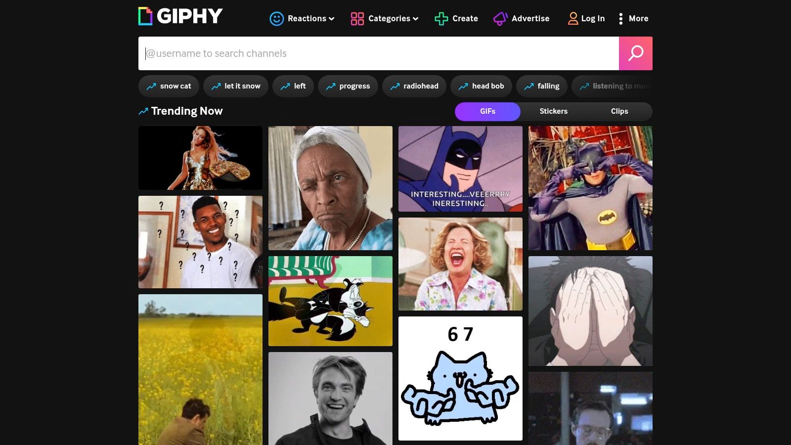
GIPHY gets recommended for funny email pictures more often than it gets approved by careful marketing teams. That gap matters.
The library is strong on instant recognition. A recipient sees the expression, gets the joke, and keeps reading. In consumer social content, that speed is useful. In B2B email, it creates two problems at once. The humour often depends on famous source material, and the joke can feel more borrowed than branded.
I treat GIPHY as a creative reference tool first, and a production source only in narrow cases. If the asset is your own upload, built from footage you control, or cleared through your legal and brand process, it can work well for onboarding emails, customer newsletters, or low-stakes internal sends. If it is a trending TV reaction pulled from the public library, the licensing position is usually too murky for commercial email.
What to weigh before using GIPHY
A reaction GIF has to clear four checks before it earns a spot in a campaign.
- Licensing clarity: Weak for much of the general library, especially clips tied to entertainment, sport, or celebrity content.
- Brand suitability: Mixed. Playful brands can carry some motion. Conservative B2B teams usually look less credible when they borrow meme culture.
- File practicality: Better than long video, but still easy to overuse. Animation can distract from the offer, slow loading, or render poorly across clients.
- Humour risk: High in prospecting. If the recipient does not know the reference, the email feels forced.
Performance matters as much as taste. A funny GIF that pulls attention away from the CTA is already underperforming. If your team is also working through email deliverability issues, heavier creative is one more variable to control rather than one more trick to try.
My rule is simple. Use GIPHY for inspiration, not convenience. Build your own short animation if you want motion you can defend. You can review the platform at GIPHY.
10. Tenor
Tenor is often the faster test for taste than for rights. Search almost any emotion and you will get a usable reaction in seconds. That speed is the appeal, and also the trap.
For email marketers, Tenor works better as a creative prompt than as a grab-and-send asset library. The funniest results are often built on TV clips, celebrity reactions, sports footage, or uploads with unclear ownership. That creates two problems at once. The licence position is hard to defend, and the joke can feel borrowed rather than brand-native.
I treat Tenor as a filter through four practical questions:
- Would legal approve the source? Usually not, unless the asset is original, clearly licensed, or created by your team.
- Does the joke still work without cultural context? If the recipient needs to recognise a meme format, B2B response rates do not get any help from it.
- Will the file behave in email? Short motion can be manageable, but animation still adds weight, competes with the CTA, and can render inconsistently.
- Does it sound like your company? A deadpan SaaS brand, a law firm, and a startup newsletter can all use humour differently. Tenor does not solve that judgement call.
There is one case where Tenor is useful. It helps creative teams find the emotional beat they want, then recreate it with original artwork, product UI motion, or a lightweight branded loop. That route takes longer. It is also easier to approve, easier to reuse, and less likely to make a sales email feel dated next quarter.
If you need a reaction asset today, Tenor is rarely the safe commercial answer. If you need a reference for timing, expression, or pacing, it can still earn its place in the workflow. You can inspect the platform on Tenor.
Top 10 Funny Email Picture Sources Compared
| Provider | Core features | Licence & commercial safety | Best for (B2B email use) | Cost / pricing model | Key pros / cautions |
|---|---|---|---|---|---|
| Adobe Stock | Large library: photos, vectors, illustrations; robust search; team/admin controls | Enterprise-grade licences; Standard licence generally permits email marketing; Enhanced/Extended for higher‑risk uses | Teams needing indemnified, high-quality images for paid outbound | Paid subscriptions / credit packs; enterprise pricing available | Consistent releases and rights clarity; humour/meme content less common; costs add up |
| iStock by Getty Images | Curated Essentials & Signature collections; strong release management | Straightforward standard licence suitable for email; strong editorial controls | Marketers who want predictable rights clearance and subscription value | Credit packs or subscriptions; Signature content pricier | Credible clearance; fewer viral/meme assets than UGC libraries |
| Shutterstock | Enormous catalogue incl. cartoons & short animated assets; API & team features | Clear standard vs enhanced licences; standard explicitly references email marketing | Large-scale programmes needing varied assets and API/team integrations | Subscriptions / image pack pricing; premium licences cost more | Powerful search and scale; quality varies across catalogue |
| Envato Elements | Unlimited downloads; many vector/illustration packs; simple project licence | Licence covers marketing when each download is registered to a project; must retain subscription to re‑license | Teams producing frequent campaigns and many lightweight vector assets | Flat-rate unlimited subscription | Predictable cost for high volume; catalogue quality mixed; subscription required |
| Canva (Free & Pro) | Templates, brand kits, one‑click editing (background removal), GIF/sticker inserts | Pro licence covers typical marketing outputs (including newsletters); check element-level rules | Fast design and on‑brand compositing for non‑designers | Free tier; Pro subscription for expanded assets and team features | Very fast for teams; must confirm licence per element; pricing/bundles change |
| Pexels | Free photos & videos; growing playful collection; no signup needed | Free for commercial use without attribution (broad permission) | Quick A/B testing, headers and low-cost newsletter visuals | Free | Zero cost; easy to test variants; popular assets can feel overused |
| Unsplash (Free & Unsplash+) | High‑quality, authentic photography; distinctive, less "stocky" look | Permissive commercial licence with exclusions (unmodified resale, likeness issues); Unsplash+ adds protections | Editorial‑style humour and distinctive headers that avoid "clip art" | Free core library; optional Unsplash+ paid tier | Great aesthetic; check exclusions and likeness rules; fewer overtly comedic images |
| Pixabay | Photos, vectors, illustrations, some GIFs; strong vector selection | Pixabay custom licence permits commercial use; no attribution required (with caveats) | Lightweight, crisp vectors and cartoons for email file‑size efficiency | Free | Excellent for vectors; verify images don't show third‑party brands or unreleased likenesses |
| GIPHY | Massive GIF library; easy embeds; brand channels & upload tools | Many GIFs contain third‑party IP; general‑library GIFs often restricted for commercial use, prefer owned/licensed | Reaction GIFs where you control asset rights or have brand/partner access | Free to use; brand/Pro partnerships available | Instant recognisability; high IP risk if you use third‑party GIFs without permission |
| Tenor | Large GIF/WebP/MP4 index; fast search; developer API (Google) | Terms restrict commercial/unsolicited email use for general library; rights vary per asset | Topical reaction clips (use licensed or self-hosted assets for emails) | Free; API with terms of use | Smaller file formats (WebP/MP4) good for performance; verify licensing before commercial use |
Choose the Laugh You Can Defend
The best funny email pictures aren't the funniest images on the internet. They're the ones that help a specific email do its job without creating new problems for legal review, brand perception, accessibility, or deliverability.
That's why popular advice on this topic misses the mark. It tends to focus on comic impact alone. B2B teams need a stricter filter. Start with the campaign's purpose. If the email is a first-touch outbound message, humour should be light and contextual. If it's a customer newsletter or webinar reminder, you can afford to be a bit more playful. If it's a leadership note, product incident update, or renewal conversation, visual jokes usually need far more restraint.
The next filter is rights certainty. If the campaign goes to prospects, customers, or a large list, paid libraries such as Adobe Stock, iStock, and Shutterstock usually make the most sense. They aren't automatically better at humour, but they're much easier to defend. Envato and Canva can also work well when your team needs speed and variation, provided someone checks the exact asset terms instead of assuming every element is interchangeable.
Free libraries sit in a more nuanced spot. Pexels, Unsplash, and Pixabay are useful when budget matters and the humour is subtle, illustrative, or editorial in tone. They're less suitable when the joke depends on a celebrity, a recognisable character, or a heavily reused internet format. GIPHY and Tenor are where teams most often overestimate what “available online” means. Visibility is not permission.
Accessibility and rendering matter just as much as taste. Graphics in email have been associated with strong engagement. One summary reported average open rates of 43.12% and click-through rates of 4.84% for emails with graphics, compared with 35.79% and 1.64% for emails without graphics, while unsubscribe and spam rates stayed similarly low, according to Vero's summary of image use in email performance. But those gains don't excuse sloppy execution. Compress the file. Keep text out of tiny image areas. Add meaningful alt text. Make sure the joke still lands if the image loads slowly or not at all.
There's also a culture test. Workplace humour today often revolves around inbox overload, ignored messages, “per my last email,” and the irritation of meetings that could have been emails, as reflected in Email Tools Guide's review of funny email memes. That tells you something useful. The safest B2B humour is usually shared frustration, not random absurdity.
If your team is running outbound at scale, the image should never lead strategy. Targeting, message fit, infrastructure, and reply handling matter more. H2 is one example of a firm that works on those outbound systems, and that context is often what decides whether a light humorous visual helps or hurts. In most professional inboxes, relevant restraint beats forced meme energy every time.
If you're testing funny email pictures inside outbound or nurture campaigns, H2 can help with the part that matters more than the joke: audience fit, message structure, deliverability, and repeatable campaign systems. It works with B2B teams on outbound programmes, GTM systems, and practical workshops that make email easier to run well. Visit H2 if you want a more disciplined approach to emails that get replies without looking generic.
